A board game designer's web site
Copyright Eric Pietrocupo

E-Mail: ericp[AT]lariennalibrary.com
Playing with colors
Ah! color, it's a bit odd for somebody like me to talk about colors since I am partially color blind. On the other hand, I might be a good thing because for example, I have problem distinguishing colors when there are many different colors exposed at the same time. There are some rules and guide lines that you can follow to make sure that the color selection does not look odd.
Primary colors
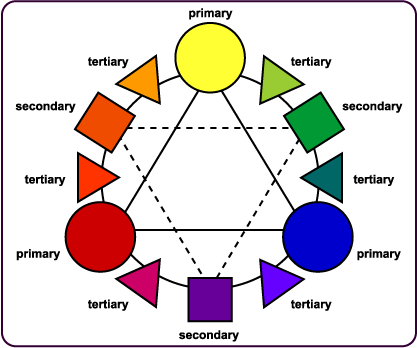
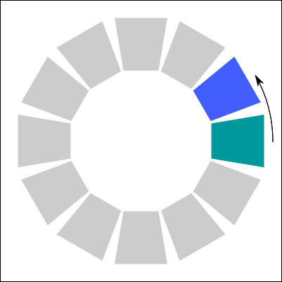
All colors are created using what we call primary colors. By mixing primary colors, you can create various different colors. For example, mixing red with yellow creates orange. Once we have the color you need, you can make it darker or lighter my adding more white or black. In real painting, the primary colors are Red, Yellow and Blue. Here is the color wheel.
 |
Most of the time, in real painting, you start with white or gray and then add some colors. This is how they mix up the paint for walls. All the gallons start as white, they add a few drop of each color, they shake a lot and you have your color. If you want darker colors, you can add a bit of black or start with a darker base color than white.
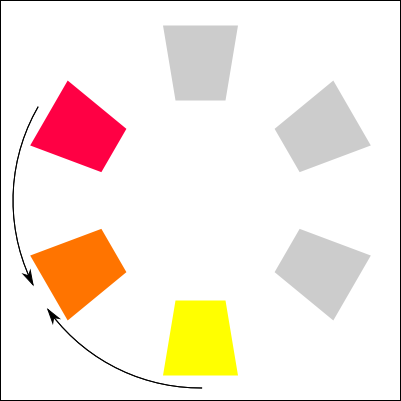
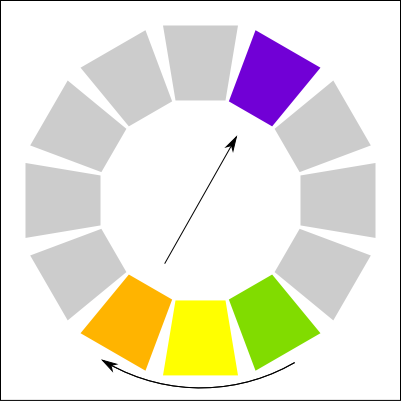
So you always start pale and go darker. The opposite is impossible to do. On the screen, that is a complete different world because computer screen use light to create colors. Light does not work exactly the same so the primary colors are Red, Green and Blue. Here is the color wheel.
 |
The positioning of the color is similar, but now for example, if you want some yellow, which is a primary color in painting, you need to mix up Green and Red. When you add up all colors together, instead of getting black, you get white. So it's now a completely different way to thinking. Getting the color you want simply consist in adjusting the right level of Red/Green/Blue you want.
If you use low values, it will be darker, if you use high values, it will be more vivid and lighter. If all 3 colors have similar values, the color will look closer to gray. It takes some time to learn how to work with it, but it is pretty easy to get used to it.
Hue - Saturation - Lightness
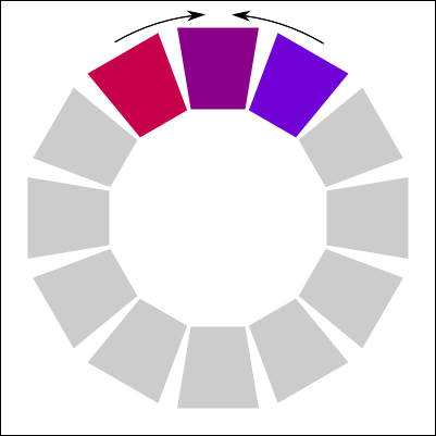
There is another ways to define or adjust the colors you need. It is called the Hue-Saturation-Lightness model. These are 3 values with totally different functions that will then be translated in the right RGB Color. I use it very often.
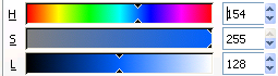 |
- Hue: Determines the color you want to use. All the vivid colors are mapped on this single value. Some software like Gimp and Inkscape shows you what are the colors for each value.
- Saturation: Determines how much colored will be your color. High saturation makes vivid colors, while lower saturation makes them more grayish. 0 saturation is always gray.
- Lightness: Determines how dark will be your color, the higher the lightness the paler it will be. A lightness of 255 is always white.
As you can see, this is another way to create colors which sometimes is much more functional than the RGB Model.
Cold, hot and Neutral colors
Colors can be grouped in 3 categories:
 |
- Hot: Violet, Red, Orange, Yellow,
- Neutral: Beige, Brown, White, Gray, Black
- Cold: Purple, Blue, Green, Cyan
It looks very odd to say, but there are fashion rules regarding how you should dress up. The rule state that it is best to mix a neutral color with any other color. This is why in men fashion, most pants are made of color black, beige and gray (which are neutral colors) while the shirts are made of hot or cold color. This why you can mix and match any pant with any shirt and it will look good.
In game design, that is also something that you should watch for. It's a good thing to mix neutrals with colors. It's a rule of thumb that seems to work most of the time.
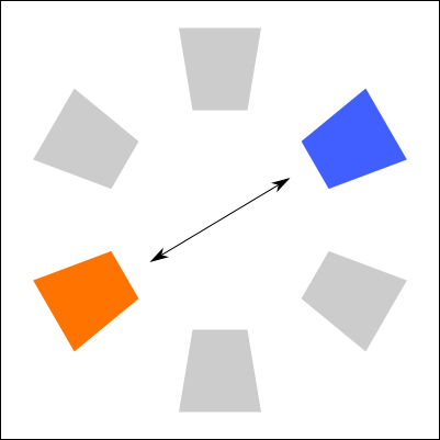
Color Contrast
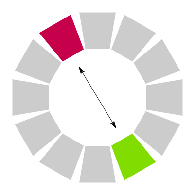
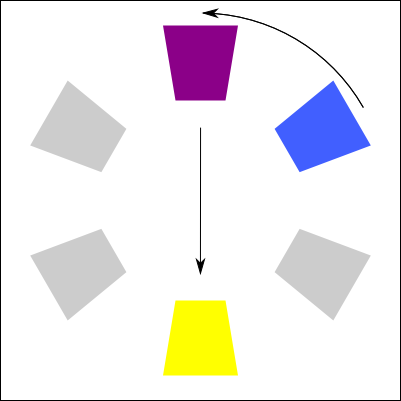
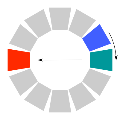
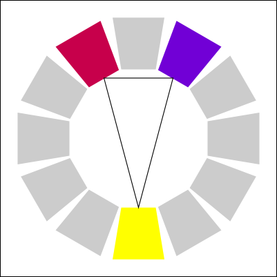
A color contrast is when 2 opposing colors on the color palette are placed together. It's the opposite of matching neutral colors with hot/cold colors. Here are some common example of color contrast, some of the text you will see below might be hard to read:
 |
Normally, color contrast should be avoided, because they are very aggressive to the eye, but sometime it could be your objective to attract the attention by using color contrast. Some color contrast could be harder to visualize by some color blind.
Vivid and dull colors
Colors can be very strong and pure, this is generally useful for player components because you want it to be easy to differentiate a player from another. But for example, when designing a board, since other components of different colors are going to be placed on it, you might want to use more dull colors to make sure we can easily distinguish the components on the board from the board itself.
A similar technique used in old school video game was to place all texture in background dark and dull, while all the texture in foreground were bright and vivid. The objective was to make sure that players can easily see which part of the screen was the stage(foreground) and which part of the screen were simply decorations (background). In some home made video games, where this rule was not followed, you often end up thinking that some piece of decoration were actually part of the game.
Color and Emotions
Apparently each color express a different emotion. I made some research about it and managed to find a diagram that illustrate this concept. I don't know how true this diagram can be and some people argued that it might change from a person to another.
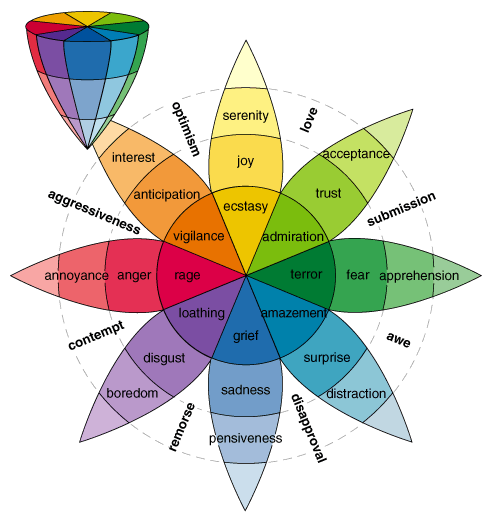 |
There seem to be some sort of esoteric interpretation of the color and it is possible that the graphic above is more an esoteric than a psychological interpretation of colors. I found other color interpretation in a book that I'll vaguely re-transcript here:
- Black: Distress, Anxiety, Death
- White: Purity, Innocence
- Gray: Doubt, indecision
- Light Gray: Fright
- Dark Gray: Fear, Monotony, Depressant
- Yellow: Knowledge, Science
- Gold Yellow: Light
- Greenish Yellow: Lie, Envy, Treachery, Doubt
- Brown: Willingness, Health, Work
- Orange: Sun, Luxury, Pride
- Magenta: Joy, Dynamism, Virility
- Red: Strength, Movement, Desire
- Red-Orange: Energy, Ardor, Joy
- Purple: Wealth, Power, Dignity
- Pink: Timidity, Softness, Romanticism, Femininity
- Blue: Faith, Spirituality,
- Light Blue: Indifference, Reverie
- Gray Blue: Superstition, Fear, bewilderment
- Turquoise: Cold, Personality Strength
- Green: Fertility, Satisfaction, Calm, Hope
- Grayish Green: Laziness, Indolence, Softness
- Light Green: Calm, Rest
- Dark Green: Indifference
- Blueish Green: Cold Aggressiveness, Thoughts
- Yellowish Green: Youth, Spring
- Violet: Subconsciousness, Secret, Mystery, Death, Piety, Nobility
- Grayish Violet: Superstition
- Light Violet: Melancholy
- Violet Blue: Solitude, Devotion
- Violet Red: Love
- Dark Violet: Disaster, Sadness.
Source: La couleur et ses accords <Colors and it's agreements>.
In board games, normally vivid colors are used for player colors. So using colors to trigger certain emotions might be used less often. There could still be situations where it could be useful to chose a color to generate emotions, for example you could chose a certain colors for a suit of cards to reflect a certain emotion.
Mixing Colors
I stumbled on an interesting book that I cited above for the meaning of colors. There is an interesting section is about how to mix colors together. I decided to recreate a copy of each method here. In the color palettes below, it use the paint colors (CMY) and not the light colors (RGB). I am not sure if the same theory could be applied to an RGB palette. Else, you would need to convert the target color in RGB.
Source:
127 p.: Ill. col.; (Fleurus Beaux-Arts)
Title could be translated as: "Color and it's agreements".
ISBN 2-215-02389-9
ISSN 0993-5347
Simple Chromatic Link
 |  |
Complex chromatic link
 |  |
Two Complementary Colors
 |  |
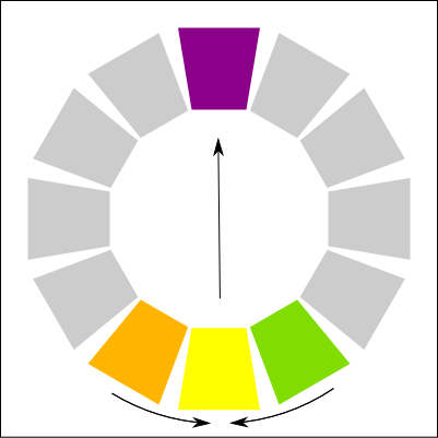
Simple chromatic link + complementary color
 |  |
Equilateral Agreement
 |
Isosceles Agreement
 |
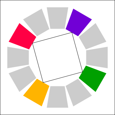
Square Tone
 |
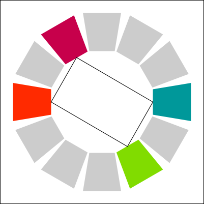
Rectangle Tone
 |
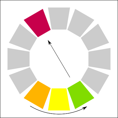
Complex Chromatic Link + Complementary color
 |  |  |
Colored printing
The biggest problem with printing in color is that it will not be shown exactly like on screen. So you might have found the perfect colors for your game and end up deceived once printed. There are still a few advices and rules that can be followed to avoid surprises at the the end. Else the best solution would be to test print until you get the color you want.
CMYK vs RGB
Why is there a problem with color printing? It is simply because the color model of printers is not the same as on the screen. As I said at the beginning of the page, in painting, the primary colors are not the same as in light. This is also the case for printing.
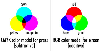 |
For printers, the primary colors are Cyan, Magenta and Yellow. When you mix the colors together, you get the color black. The default color is white, which is the color of the paper. In RGB, it's the opposite, the default color is black and adding all colors together will give you white.
Now one thing they have realized is that when you wanted to print some black, the printer needed to combine all 3 colors together. It had the effect of depleting the ink rapidly and the final output looked more like a very dark brown rather than black. So they decided to add black as a 4th color which created the CMYK model (Where K stands for black). With black as a separate color, you can still print in black an white, and it will use black to print darker colors.
Color space
How come the conversion from a model to another does not work correctly? This is because some colors cannot be displayed by both model. In the picture below, you can see the color space of all the colors that the naked eye could actually see. Since you are viewing this on the screen (RGB model), some colors are actually fake.
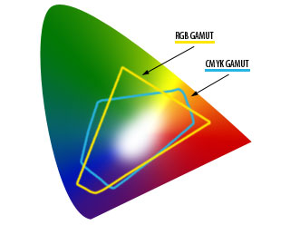 |
On the illustration, you can see the color range that can be displayed in RGB and the color range that can be printed with CMYK. Some portion of the colors are visible by both model, but other colors are only visible by one of the models. So what happens if a color does not exists in a certain model, it is simply modified to the nearest color. The results depends on the color management software used for the conversion.
Differences in printed colors
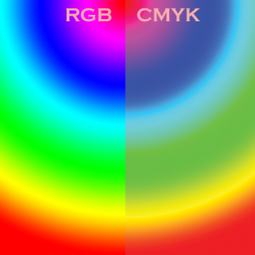
There are 2 things you should consider about the colors once printed. First, the colors will be darker than they appear on the screen. So even if darker colors seems more cool, always try to do something lighter than what you want. Else you could end up with some problem, especially if there is text. Second, colors will look more dull than on the screen. I found a picture on the net that attempts to illustrate the difference between both color models. It will give you an idea of the differences.
 |
So there is a lot of things to consider when selecting colors. If you really want perfection, the best solution is to test print until you get what you want. Else, using lighter and less vivid colors could do a great job.
<< Border and cutting lines | Table of contents | Adding Details >>
Powered by PmWiki and the Sinorca skin