A board game designer's web site
Copyright Eric Pietrocupo

E-Mail: ericp[AT]lariennalibrary.com
Adding Details
When designing components, there are tons of details that you should consider to make your work looks good. The more experienced you get, the more details you will be able to add. In this section, I'll take some example I already made and expose the details. Even if it's talking about details, I will still be explaining simple details.
Drop Shadows
A drop shadow consist in taking copy of an object, make it all black, place in it background and offset it slightly so that it looks like the top object has a shadow. A basic drop shadow does not have to be very fancy. Just a carbon copy will of the object could do a great job. Here are some examples:
 |  |
The goal of drop shadows is to give more dept to your design. It also make a separation with the background, which could increase the readability of the text. Some software offers a drop shadow effect, but if you are lacking that feature, you simply make a black clone of your object. You can also blur the shadow, it will make it less sharp and look like a real shadow. Here is an example:
 |
Bevels
The bevel effect is the second most popular effect because it creates some sort of artificial third Dimension. The basic concept of a bevel is to raise the object from where it stand like if it was a button. Here is a generic bevel effect:
 |
Most of the time, the lighting will come from the upper left area which will create shadows in the lower right areas. Still, bevel effects can get much more complex than that. In corel paint shop pro, the bevel effect was very sophisticated and could allow to create various kind of bumps. Unfortunately, GIMP and Inkscape are not equipped to do this. The example below was created using 2 different bevel functions:
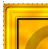 |
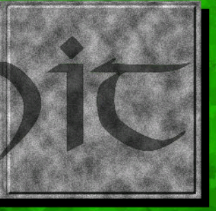
Sometimes, it is possible to create artificial bevel effects. If the level of detail is very small, it will not be visible once printed. The example below is an artificial bevel created with 3 lines of different colors:
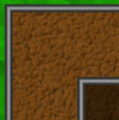 |
How do you know it is fake?, Well there is no lighting on the upper left and no shadows on the lower right. Here is a close up illustration.
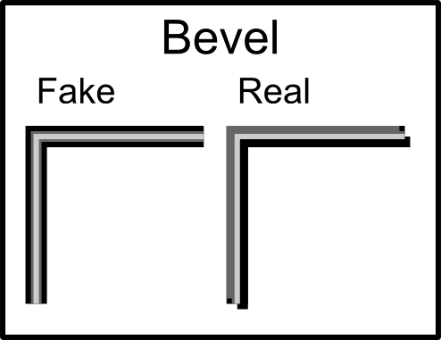 |
But fake bevel can sometime do a good job, especially if they are small.
Borders
Sometimes you need to create edges inside your components. For example, if there is a picture, you might want to create a frame around it to make the transition easier with the rest. So basically, you can simply place a black border around your picture, but there are much more elegant ways to do this. Here is a simple example:
 |
Yes it has a black border, but it also has an interior white border which really creates a different effect. When I made a variant for age of mythology, the original designer used a double border everywhere in their components. I decided to do the same when making my components.
 |
It's very nice and simple to create. You create your interior circle, make a duplicate and apply the "Outset" effect. It is also possible to place borders around text. If done in a very subtle way, it can sometimes add depth.
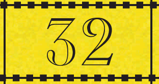
 |
In the picture above, there is a dark gray border around the number which creates a fake engraving effect. Since the number was very small, it did not really appear fake once printed.
You can also combine various borders together. Another common effect is to mix dash and full lines together to create different kind of lines. The example below is composed of 2 different lines:
 |
So there is an infinity of borders that can be created, just use your imagination.
Decoration
Adding decorations to your components is another way to add details. Decorations might require more skill and time to make. In my case, I have used dingbats as a source of decoration and it worked well. Here is an example of decorations made with dingbats.
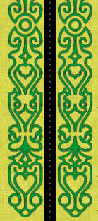 | 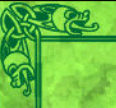 |
The first picture has been done with a font that draw lines while the second picture was made with a dingbat font. There are a lot of dingbats that gives decorations for creating corners. You should check it out. But still, if you cannot find any dingbat that has the right decoration for you, you can always make decorations using simple shapes.
 |
In the example above, the decorations are made of a circle and a triangle that has been duplicated around a circle. So 2 basic shapes that gives interesting results. Again, use your imagination, there is a lot of possibilities.
Translucency
Most software allows you to change the alpha level of a color or change the opacity level of a layer. This allows you to create translucent effects. Translucency allows you to see through another object. We are going to see here simple translucency, but there are many other modes available, we will see them more in the "Texture" section. Here is an example of simple translucency.
The rectangle in the middle is made of a single translucent color. If you look carefully, the green texture can be seen behind the rectangle. So the rectangle change the color you see but the pattern remain the same. This example was used to create cards. The translucent area was brighter which made it easier to place readable text inside. Placing text directly on the texture would have been hard to read.
Translucency can also be used with text. In the example below, I decided to place some translucent text directly on the track. The goal was to reduce the amount of space that was required for the track. Else, I would have needed extra space above the track to write it's name.
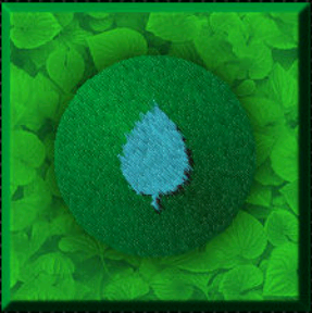
Icons
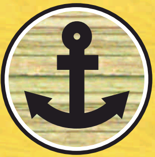
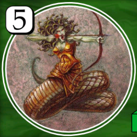
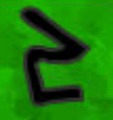
Sometimes, an illustration can help the players visualize better your components. So a good idea is to combine text and picture. Artwork illustrations might be harder to do or more expensive to acquire. But sometimes a simple black and white icon can do a relatively good job.
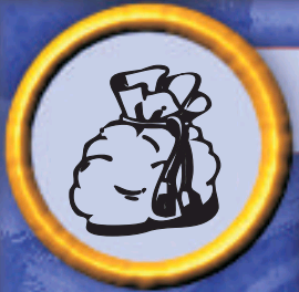 |
The example above was made out of a dingbat. Since the icon is not very large, a black an white icon does not look too odd or ugly. The icon was placed in the corner of the card.
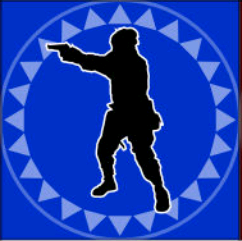
Icons can also be used to illustrate some rules of the game. Some games, like "Bang", replace text special ability with icons. Personally, I don't like it because it gets really confusing, but if you use icons as a support your rules, it will just make the game clearer. One thing which is important is to be consistent through the game. If a concept is represented by a certain icon, use this icons though all your components. Here is an example of icon being reused multiple times.
 | 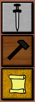 | 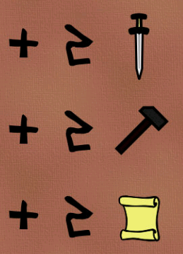 |
Fonts
Another thing where you should be consistent is with fonts. I not talking about dingbat here, but rather regular text font. You will need font for writing text, numbers, titles, etc. There is not a scientific limit to how many fonts your game should have, I strongly suggest using around 3 or 4 fonts. Too much font will make your game confusing.
Search websites for the fonts you need which would fit well with the theme of your game and keep these fonts for the design of the whole game. You must be consistent in how you use these fonts. For example, if you use a particular font for numbers, all the numbers in your game should have the same font.
Even if special thematic font look cool, it is not always easy to read. So you will need 1 or 2 "Normal" fonts for writing rule text. For example, the special ability text on a card will be written with a "Normal" font. Some people suggest using sans serif font (ex: Arial) because they are easier to read than a font with serif (ex: Times new Roman). It's up to you.
<< Playing with Colors | Table of contents | Creating Textures >>
Powered by PmWiki and the Sinorca skin